
From prompt to scalable interface
View prototypeOverview
The product
VeLVision is a management SaaS for the automotive sector, where answering a lead first decides the sale. An omnichannel AI agent was the strategic bet to solve two pains: leads lost outside business hours, and time spent on unqualified leads. The agent was running for only 6 clients, each one configured by hand by CS, product and engineering together.
My role
Product Designer responsible for the end-to-end design. I led the discovery, talked directly to stakeholders, structured and ran the usability tests, and presented iteration decisions based on the evidence collected.
Team and duration
Me, a Product Owner, frontend and backend developers, a data engineer, and direct contact with the CS team. From discovery to deploy: 1 month and 2 weeks.
Discovery
The context
The challenge wasn't building the feature, it was figuring out how to make it configurable by someone who didn't know what a prompt was.
CS already tracked which customizations managers asked for most, and that gave us a starting point — but the requests told us **what**, never **why**. Understanding the motivation behind them was what discovery had to solve.
What we investigated
What we found
Curation > interface
I worked with Engineering to map which prompt variables affected the AI's behavior, personality and business rules — and ran card sorting with users to prioritize which of them had the most demand for configuration. That curation defined the scope of the flow and mattered more than the screen design.
Perceived control
The manager didn't want to customize everything; they wanted to feel they had a choice. Discovery wasn't only about UX — it was about reverse-engineering the existing process to understand which points drew the most interest in configuring.
Inventory as proof
The manager needed concrete proof that the AI already knew their business — without it, any promise sounded abstract.
Zero jargon
Technical terms blocked adoption — everything had to become plain language.
CS as a safety net
Shadowing revealed that in the manual process it was CS who absorbed the manager's anxiety at every step: answering questions, giving examples and reassuring the client that the product would work. That human was a central part of the flow, and I was about to take them out of it.
Fear of hallucination
In the workshops, the managers' main fear was the AI making up information about vehicles or dealership terms. With the human contact removed from the flow, that fear would need another safeguard.
"But does it already integrate with our inventory directly?"
The core decision
The direction
Treating configuration not as a technical form, but as a translation layer between engineering and business: the entire flow revolving around business decisions, never prompt parameters.
The tradeoffs
| Decision | Gain | Cost |
|---|---|---|
| Simplicity vs. flexibility | Pre-defined cards lower the barrier to entry | They limit managers with very specific needs |
| Abstraction vs. transparency | Hiding the prompt logic makes it easier to use | It creates a black box for the user |
| Speed vs. richness | The <5min target keeps setup fast | Fine-tuning the AI's behavior was left out |
The solution
The structure
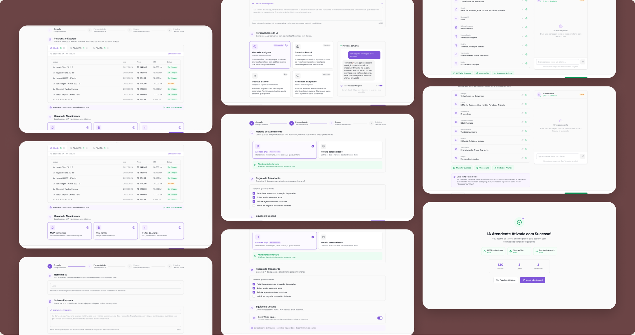
A 4-step wizard, ordered to build trust before asking the manager for any decision.
The principles
From inventory to publishing
The order of the steps is the trust strategy itself: first the concrete proof (inventory integrated), then the choices (personality), then the commitment (publish). Each step delivers reassurance before asking for the next decision.
Business language as the interface
Every label, option and example was written in the language that showed up in the workshops with managers, not in the language of the engineering that produced the data.
Decide, don't fill in
Cards with real communication profiles instead of open fields. The manager picks between concrete options rather than describing what they want from scratch.
Show before asking
Each personality card includes a real example of the AI in conversation. The manager sees the behavior before committing to the choice.
The steps
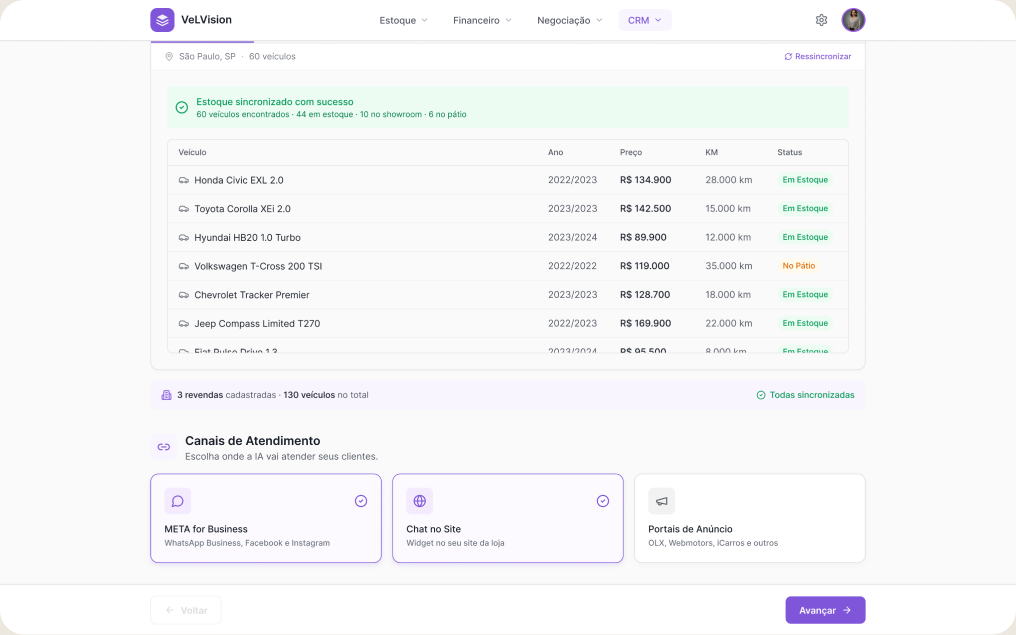
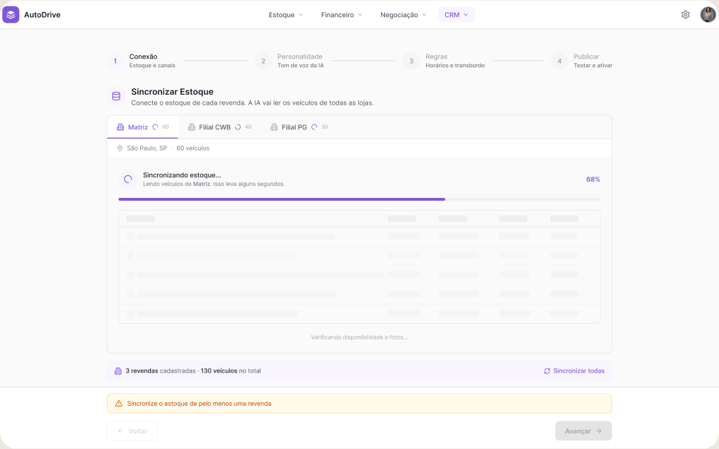
- 01Connection
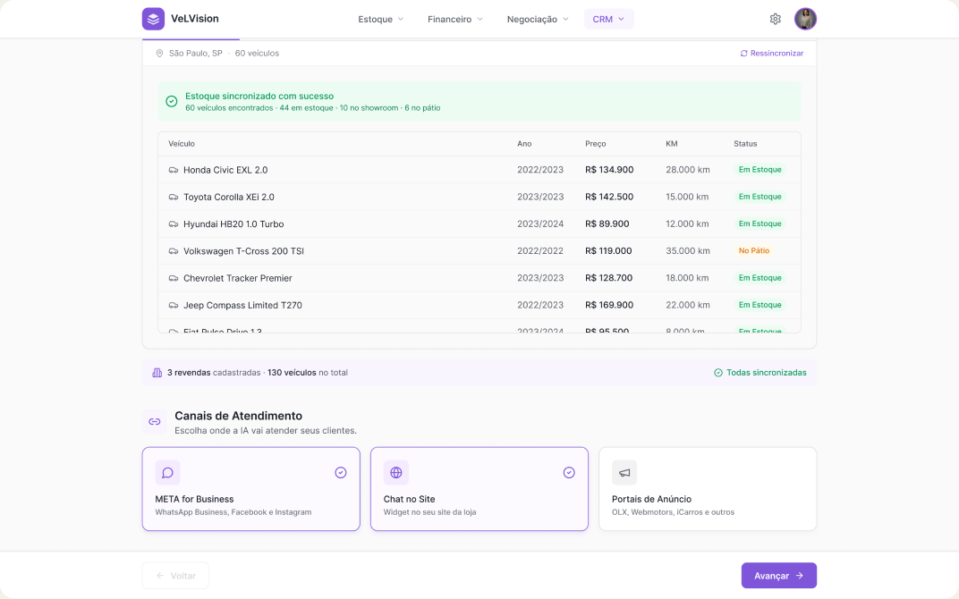
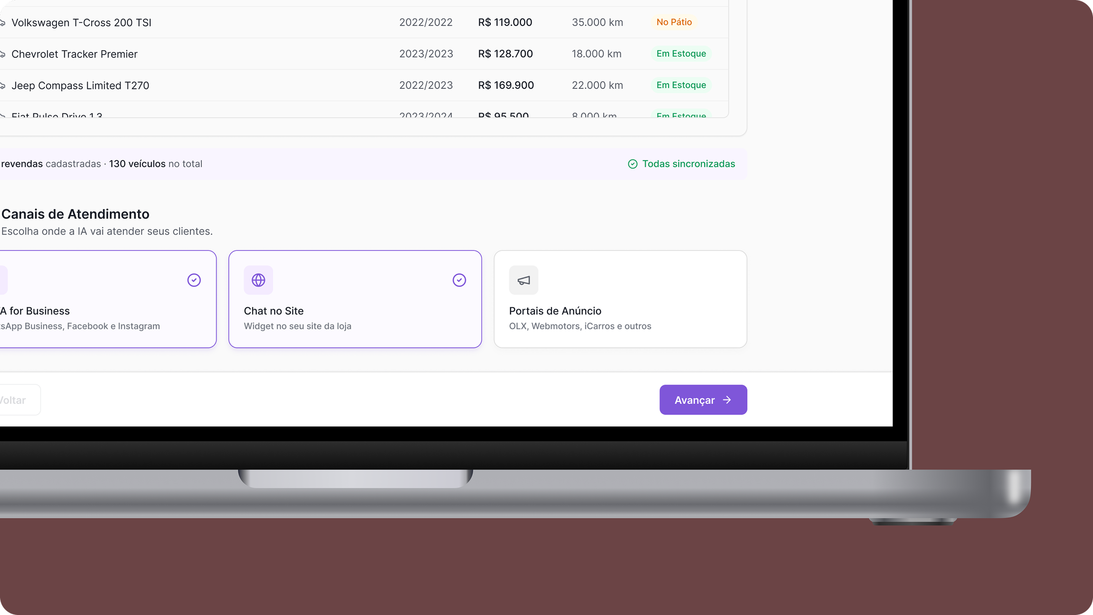
Inventory sync + choosing the service channels.
Inventory was the managers' main uncertainty in the workshops — so the first step delivers concrete proof: they see their own vehicles on screen before making any decision.
- 02Personality
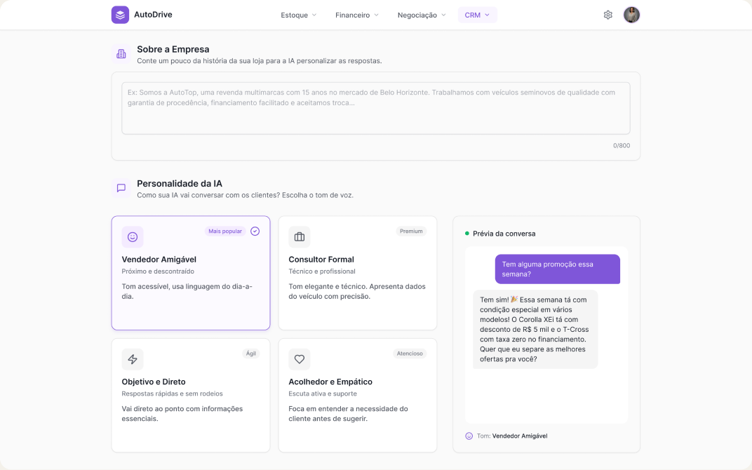
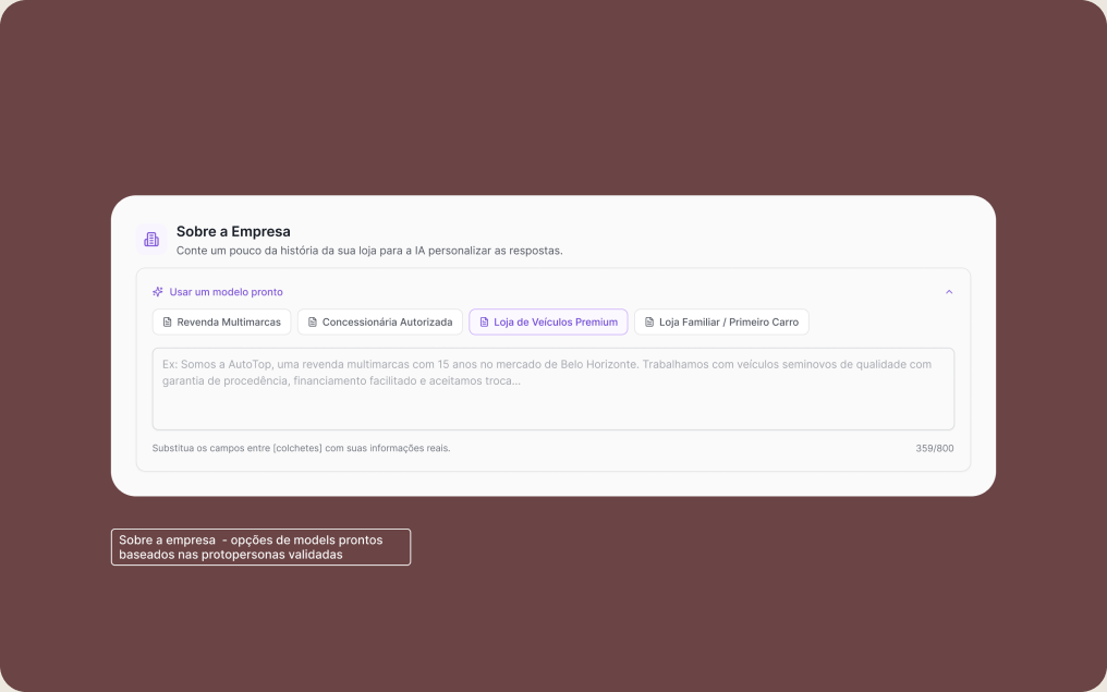
Name, communication profile and dealership details.
Discovery showed the manager wanted to feel they had a choice — so every option comes with real conversation examples of how the AI would behave, while the complexity of the prompt stays invisible.
- 03Rules and handoff
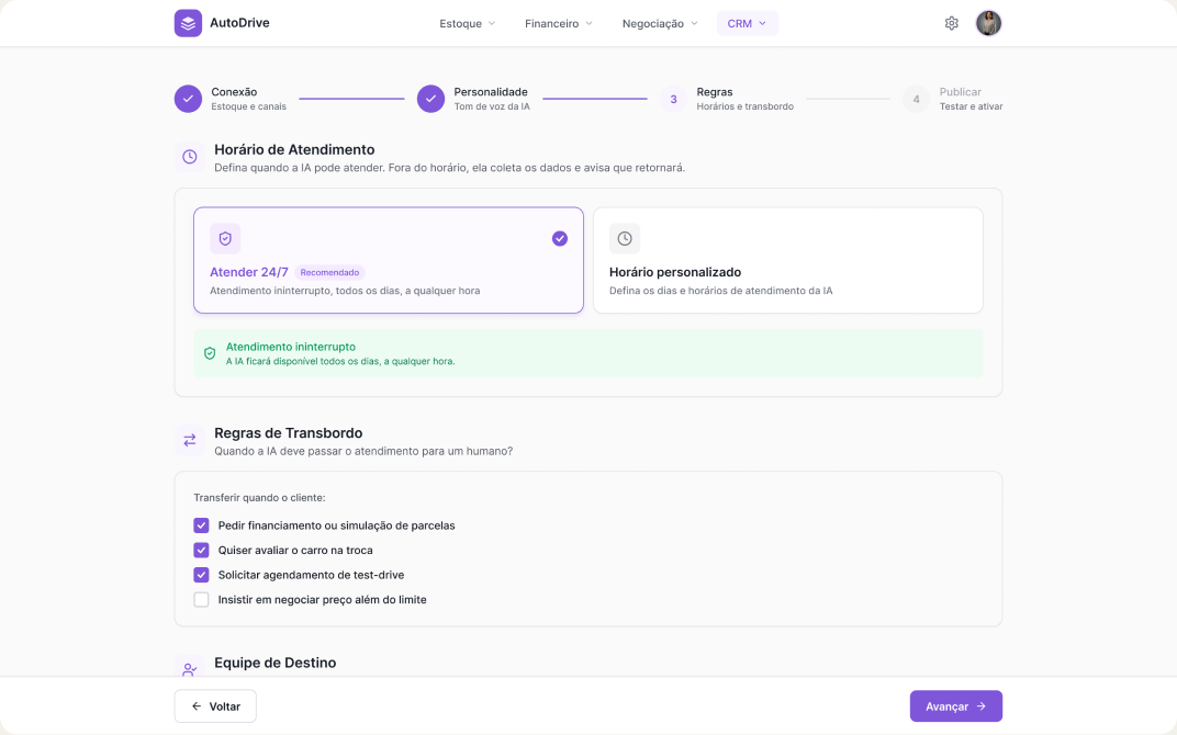
Business hours, handoff to a human and lead distribution.
Card sorting and the workshops revealed these were the settings with the most demand — every field came from prioritization with users, not from a technical list.
- 04Checkout
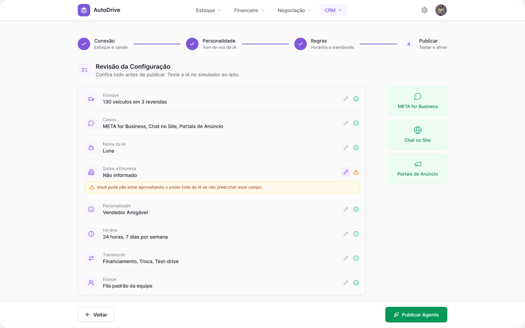
Review and edit.
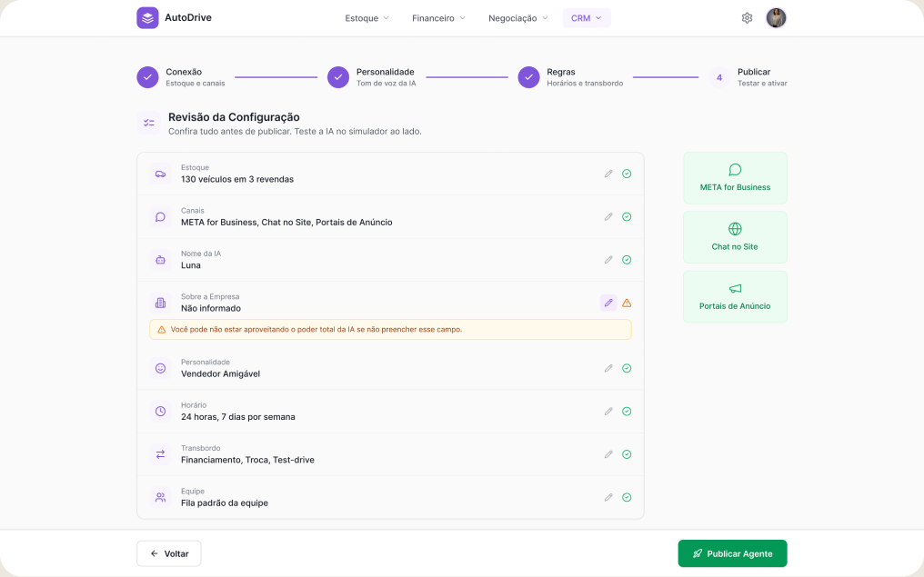
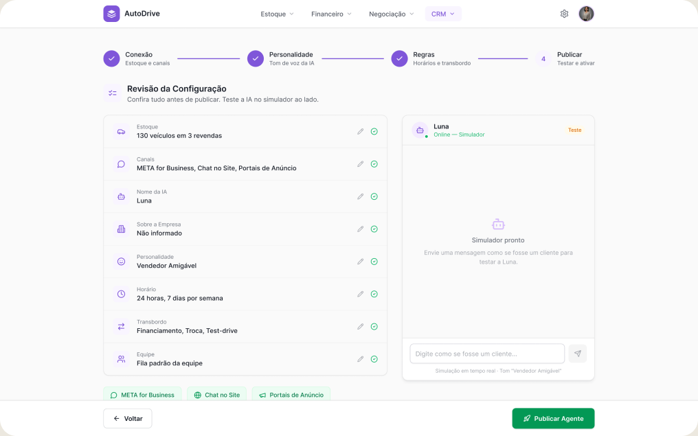
checkout for a high-level review and edit of everything that was set up
The rules
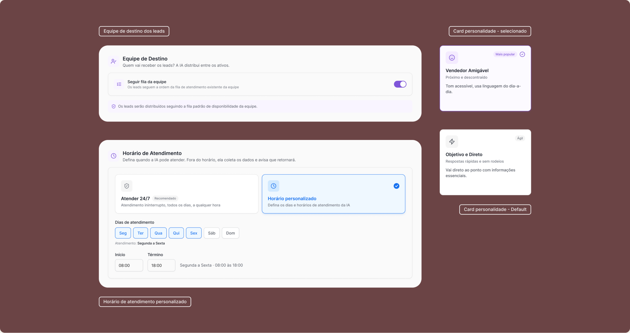
Validation and iteration
The method
I reviewed the prototype with CS and tested it with 13 users across 3 sessions, using real tasks.
The iterations
Sync redesigned
The most counterintuitive mistake of the project: the original design was too efficient. The integration happened fast and silently — nobody noticed it had happened. I reinforced the timing and the visual feedback, and seeing the inventory integrated became the trigger that raised commitment to the rest of the setup.
Playground at checkout
Even with different examples and models, users hesitated to publish — the fear of hallucination that showed up in discovery came back in testing. The Playground was added as one more layer of trust before publishing — literally what the human contact used to provide.
More supporting material on the cards
The initial copy on the personality cards wasn't enough for the manager to grasp the impact of the choice. I added real conversation examples to each preview plus contextual supporting copy — managers started deciding with more confidence and without asking for help.
The "about the company" field became optional
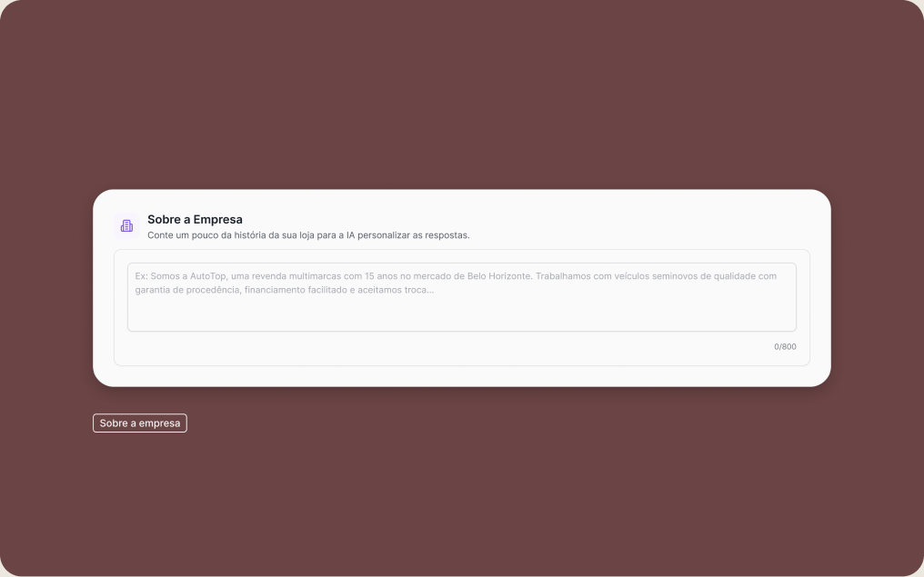
In the first round of testing, 3 of 6 users skipped the field. Since it affects personalization and not quality, I made it optional and added a notice at checkout. In the next round, 4 of 7 skipped it — and 3 of those went back to fill it in after the notice. The manager's autonomy was preserved without costing personalization.
Publish button with an intermediate state
When optional fields were left empty, the button started showing a confirmation state with messages explaining how filling them in would improve the AI's personality — a safety layer at the tensest moment of the flow.
Before and after
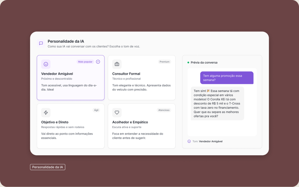
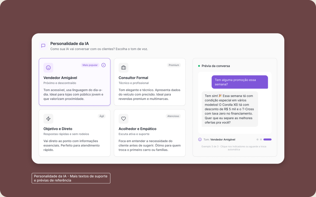
Impact
For the business
Expansion unlocked
The platform started activating new clients on the AI module without growing the internal team at the same rate. Setup that used to block entire sprints now happened in minutes, done by the manager themselves.
Engineering back on core work
No more activations eating into committed sprints. The 2–4h of engineering each activation consumed went back to the product's main deliverables.
For the product
Trust strategy validated
The translation layer between engineering and business made support-free configuration possible. The Playground replaced CS as the trust mechanism — and user behavior confirmed it: 100% interacted with the AI before publishing.
Learnings
The invisible decision
The most critical decision I made on this project wasn't visual — it was sitting down with Engineering and deciding which prompt variables would be configurable and which would be fixed by rule. The interface is only the visible tip of that process.
Replacing a human takes more than usability
Taking CS out of the process wasn't an interface question, it was a trust question. The Playground didn't come out of a UX practice, it came out of an emotional gap that shadowing made visible.
Scope is the design decision
The curation with engineering and the understanding of what users valued — which variables to expose, which to fix — shaped the outcome more than any layout or interaction decision. What was left out of the flow mattered as much as what went in.
What's next
100% of managers used the Playground before publishing — that behavior is a direct signal of where trust still needs to be built. The next step is using the Playground's interaction data to spot patterns of doubt and refine the contextual examples automatically.
Beyond that, today the manager activates the AI and loses visibility of what happens next. A performance dashboard would close that loop: post-activation monitoring that keeps trust alive, generates continuous value and allows iterating on the AI's behavior based on real service data.